Logos play a major part in branding. A well-designed and easy to recognize brand logo has a fantastic impact on the bottom line and worldwide sales of a company. A good logo can attract people easily.
Check out the 7 most famous brand logos you might not have realized that they actually have a hidden meaning.
1. AMAZON

Amazon is the most famous online shopping site.
The yellow arrow in their logo begins with the letter ‘ a ‘ and ends with the letter ‘ z ‘ which means they sell everything from A to Z. The arrow is also a smile, with a stylized dimple or smile line being the arrowhead.
2.BASKIN ROBBINS
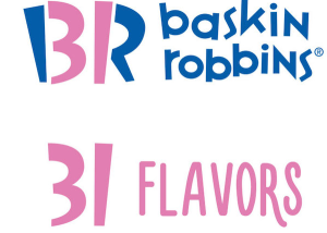
Baskin Robbins is famous for its ice cream flavors and its owned by Dunkin Brands is the world’s largest chain of ice cream specialty shops, best known for its 31 flavors.
The famous number is hidden in the letter ‘B’ and ‘R’ is known as number 31.
The logo represents fun and energy, much like eating their ice cream during (and after) eating.
3. FedEx
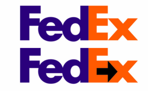
FedEx is the courier shipping company with a very interesting logo.
There is a symbol of ARROW between the letter E and X which symbolized the act as a subliminal message for speed and precision.
4. L.G
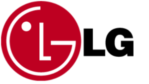
LG is a worldwide brand and its a logo with the letter ‘L’ & ‘G’ are actually helping to create a face. The ‘ L ‘ is the nose making up and the ‘ G ‘ is the rest of the face.
This gives a human element to the brand and makes it more inviting and accessible.
5. AUDI
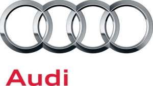
AUDI is the most luxurious car with a very unique Logo.
The four rings in the logo represent that the four motor vehicle manufacturing company came together and create one brand.
6. ADIDAS
ADIDAS is the most famous shoe brand , In addition to being an integral part of their shoe design, the three stripes became their logo. These stripes are said to be a mountain that symbolizes the challenges that athletes must overcome.
7. GOOGLE
Another unbelievably recognizable logo around the world (even after their recent redesign), Google’s logo should symbolize that they don’t play by the rules and know how to have fun. They chose to relay their message with color rather than having a crazy font or symbol. They stuck with the palette of primary color but broke it with a green, secondary color.
Which logo amazed you the most? Tell us in the comment section below.